
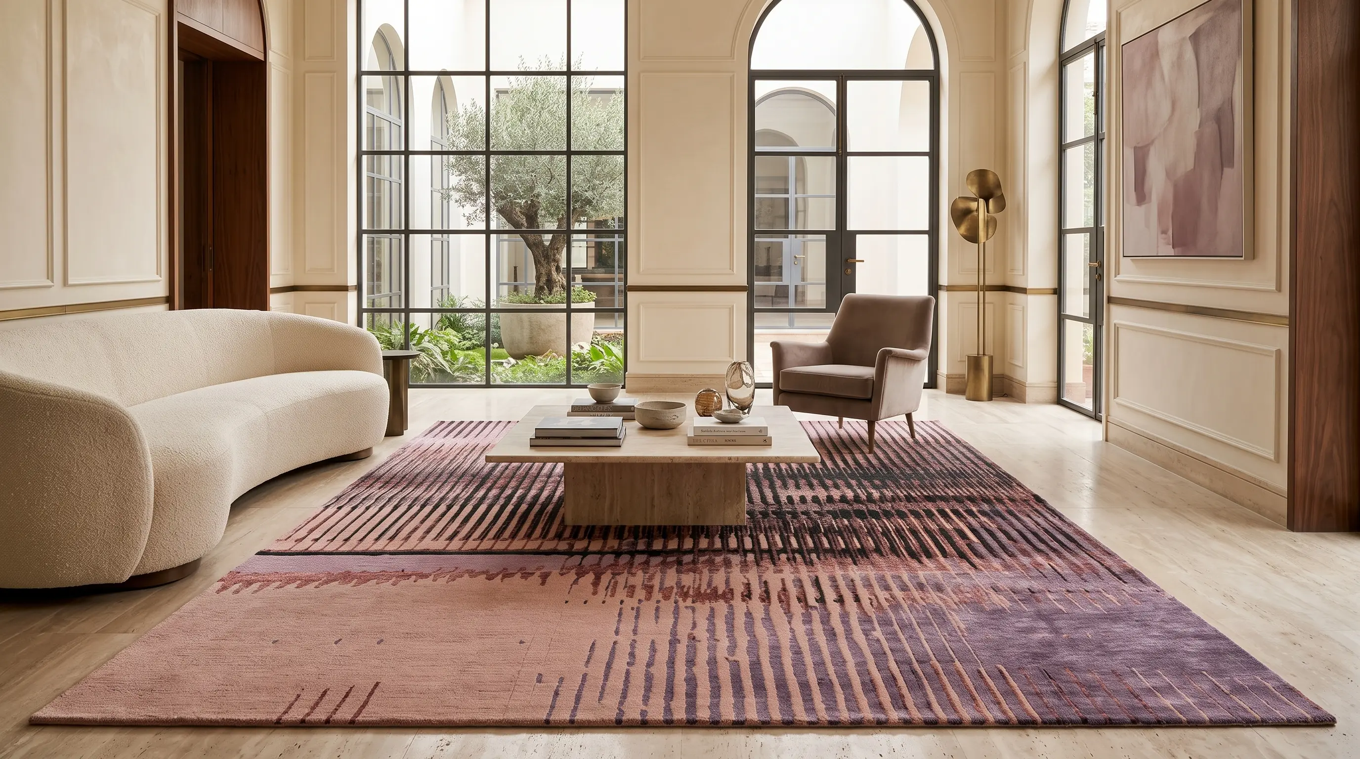
Most abstract rugs are designed around a motif.
A shape, a form, something the eye can follow and hold onto.
FROST is built around something different, a frequency.
Vertical lines, loosely repeated. Controlled irregularity in the mark. No border, no central motif, no obvious place for the eye to land and stop.
That restraint turned out to be the design's real strength.
Why vertical lines work differently on a floor
Vertical lines in a room pull the eye upward.
On a wall or a curtain, that movement is expected. On a floor, they create tension, as the lines point somewhere the space can't follow. The result is a rug that suggests movement while staying completely flat.
This is what gives FROST its architectural quality. It changes the feel of a room without trying to dominate it.
What "one design language, three colourways" actually means
When the line structure was strong enough to hold a room on its own, colour became the only remaining variable.
And colour, it turns out, does the entire emotional work.
The three FROST colourways aren't variations of the same mood. They're three distinct rooms.
The original Teal colourway - Deep slate-teal as the dominant field, cut through with warm amber. Grounded and atmospheric - there's weather in it, the sense of a room that knows what it wants to be. Works naturally alongside aged wood, leather, and materials that have some density and history to them.
Champagne Warm gold colourway - Threading through an ivory ground, with the faintest cool undertone keeping it from tipping into yellow. It reads as light through something thin - first morning, pale winter reeds. The quietest of the three, but not the least present. Best suited to spare, considered interiors where the rug carries the only layer of texture without competing with anything else in the room.
The Mauve - Most complex of the three. A warm, dusty rose ground with deep forest green moving through it, cool against warm, botanical against structured. It has a tension the other two don't have. Not a soft room. A room with something to say.
Why restraint is harder to design than it looks
A limited vocabulary means every decision is fully visible.
With FROST, there was no pattern complexity to absorb a miscalculation. Line weight, density, pile height, colour saturation. Each one tested and adjusted until the space between the marks carried as much as the marks themselves.
That's the difference between a minimal rug and one that just looks empty.
The former earns its quietness. The latter never quite arrives.
A practical way to think about it
Before choosing a colourway, ask what the room already does well.
If it has materiality, the wood, stone, leather, aged finishes - Teal sits into it naturally without fighting for attention.
If it's spare and intentional, built around light and negative space, Champagne holds the room without adding visual weight.
If you want the rug to set the mood rather than just occupy the floor, Mauve is worth a long look.
FROST works across all three because the design underneath the colour is strong enough to carry each one independently.
FROST is part of the DOTS Living SOHO Collection. Handcrafted in New Zealand wool and botanical silk. Available in three colourways and bespoke sizes.